
Brick Heck is the reason I have a font problem. And maybe you do too.
There are three TV shows I love with my whole heart. Modern Family. My Family. And The Middle.
If you notice very carefully, and definitely not because it’s quite obvious, all three are family sitcoms. And yes, I know what you’re thinking: why on earth are we talking about TV shows on a design agency blog? To which I say: I have free will and I wanted to, duh. Fight me. No, I’m messing. There is a reason. I just like giving some preamble.
The unexpected thing Brick Heck and a design agency have in common
One of my favourite shows is The Middle. It’s an American sitcom set in Orson, Indiana, about a completely normal, financially chaotic, loveable family called the Hecks. And the youngest kid, Brick, is obsessed with fonts. Has been since series one. Runs a font club at school. Starts a podcast about them. Collects objects based on their typeface. Wears font-related joke T-shirts. Has strong, unwavering, non-negotiable opinions about kerning.
And here comes the link. We’re a design agency. We think about fonts just as much as Brick does. He he. Told you there was a link.
And you, my fellow designer, and if you’re not a designer hello, nice to meet you, maybe give our LinkedIn a follow and drop your job role in the comments, I’m not a social media guru as you can tell from my first blog post but I’m doing my best, can’t hurt a girl for trying to get more likes, are probably either laughing because you too agree, or you have absolutely no clue what I’m talking about. Either way, buckle in. You’re in for a wild ride called my brain at 2am.
How I accidentally became Brick Heck
The thing is, the first time I watched The Middle, I didn’t fully get the font jokes. They washed over me. To be fair, I was a sweet naive child who was watching entirely for my crush on Axl Heck. But somewhere around watch four something shifted. And now, on my twenty-fourth watch through, I pause the show every single time Brick mentions a font to explain the joke to my partner. Every time. Without fail.
My partner looks at me with a very specific face. The face that says: please either press play or put something else on. Like the new season of House of Dragons, which we still haven’t watched, and yes I’m aware, and no we’re not talking about that right now.
The thing is, somewhere between watch one and watch twenty-four, I became Brick Heck. Unfortunately.
I am genuinely causing pavement traffic problems
It wasn’t one specific moment. It was a slow, unfortunate accumulation of evidence.
I’m in a shopping centre clocking the font on every sign we walk past. I’m at a restaurant staring at the menu thinking: why Comic Sans? This place charges £80 a head. Why. Comic. Sans. I’m out with my partner and I’m explaining, completely unprompted, mid-walk, the entire cultural history of a typeface and what it says about the brand using it.
The face I get back is the same face Brick’s family gives him. The “yeah, and?” face. The face of someone who loves you and is very patiently waiting for this bit to be over.
And that’s when I thought: maybe people don’t care about fonts as much as I think they do. Reasonable conclusion. Most people are not stopping mid-pavement to critique kerning. That’s a me problem. I should really stop doing that. The amount of times I’ve caused pavement traffic collisions is embarrassing. We now only go shopping on a day we know I’ll be quiet.
But then TikTok happened.
Why fonts matter: the TikTok proof
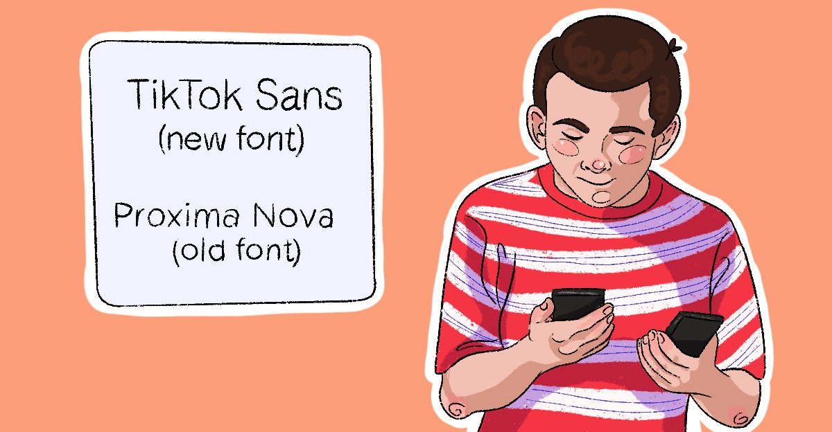
A while back, TikTok updated their font. Not dramatically. Not obviously. Just slightly. A small shift that most people couldn’t name or point to. TikTok absolutely lost it.
The font change I nearly missed entirely
What’s even wilder is that I didn’t notice it at first. People were genuinely freaking out and I thought, yeah, it looks a bit different, but I also wear glasses that need updating every two years and I’m currently on year four of this prescription. So you know. I gave myself a pass. But once I actually looked, there it was. A tiny change. Enough to unsettle millions of people who would tell you they don’t care about fonts.
Why TikTok changed their font in the first place
TikTok developed a new font that was accessible to their needs and standards, and honestly with most businesses it’s completely normal to develop your own brand font. The fact that millions of people noticed and reacted, even without the vocabulary to explain why, is the whole point. People feel fonts before they can name them. That’s not nothing. That’s actually everything.
Which tells you something important. People care about fonts. They just don’t always know they care about fonts. The feeling is there before the vocabulary is. Brick Heck has the vocabulary. Most people just have the feeling. And the feeling is real.
Here’s something nobody asked for but I’m telling you anyway
Did you know there are actually two different names for fonts, and they mean two different but also somehow the same things, and the distinction makes me feel like I’m losing my mind every time I try to explain it? No? Great. Here we go.
Typeface vs font: the Oreo explanation
A typeface is the family. Think of it like a brand. Oreo is the brand. That’s the typeface.
A font is the specific version within that family. Oreo Original, Oreo Gold, Oreo Thins, Halloween Oreo. Same brand, completely different expressions. That’s what fonts are within a typeface. Times New Roman Bold, Times New Roman Italic, Times New Roman 12pt: all fonts, all under the same typeface family.
Most people use them interchangeably and honestly I don’t think anyone really cares, including me if I’m being real. I’ll say “I used Outfit Bold” not “I used the Outfit typeface in bold.” I don’t even know if I used the word typeface correctly just now. See? Doesn’t matter. You know the difference now and that’s enough.
So why do fonts matter for your brand?
Here’s what the TikTok chaos proved, and what Brick Heck has been trying to explain to his family for nine seasons: fonts are already communicating before you’ve said a single word.
Fonts talk before the words do
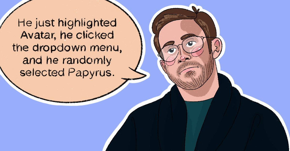
You see Comic Sans on a sign and your brain immediately goes: oh, that’s a meme. You see a clean considered serif on a luxury brand and something different happens. Or, you see Papyrus on a wellness menu and you either feel calm and holistic, or you feel a very specific secondhand embarrassment on behalf of Ryan Gosling. (There is an entire SNL sketch about Papyrus being used as Avatar’s title font, featuring Ryan Gosling playing a designer slowly losing his mind about it. Everywhere he looks: Papyrus. Everything he thinks: Papyrus. He cannot move on. He will never move on. I love it with my whole heart. Definitely because I agree as a designer. And not at all because of Ryan Gosling.)
That response is not random. That’s design working, or not working, quietly in the background.
The £80 restaurant with the Comic Sans menu is a good example. Nothing about the food changed. The price didn’t change. But something felt off, and that moment of doubt matters more than people realise. Your font is part of the first impression whether you chose it intentionally or not. Using whatever came installed on your computer is still a choice. It just might not be the one you’d have made if you’d thought about it.
Fonts and accessibility: the bit that gets swept under the rug
Accessibility gets talked about, but it also gets quietly swept under the rug more than it should. The job isn’t just to pick the fun font because you like it. It’s to pick the font that will actually help the project and the people interacting with it. Certain typefaces are significantly easier to read for people with dyslexia or low vision. A decorative script in a tiny point size isn’t just an aesthetic misstep, it’s shutting people out. We can’t isolate a group of people for the sake of aesthetics. A well-chosen, readable typeface is doing something genuinely useful for real people, and that matters more than the font being interesting.

You probably already care. You just don’t know it yet.
In a room of a hundred people, maybe one or two will read this and feel completely seen. The ones who’ve been pausing TV shows, explaining jokes, staring at restaurant menus a beat too long. Those are my people. Welcome. The font club is recruiting. We meet on Wednesdays. We discuss over a McDonald’s. And no one tell my partner and family that I’ve still not watched House of Dragons and that I’m already planning my twenty-fifth watch of The Middle despite finishing it as I type this article.
The other 98 have mostly had the TikTok feeling at some point. That low-level wrongness when something shifted. That unexplained preference for one menu over another when the food was the same. That thing that made one shop feel trustworthy and another feel slightly off, before you’d read a single word.
That’s why fonts matter. Not because designers are precious about them. Because they’re communicating constantly, to everyone, whether anyone chose them intentionally or not.
As Brick Heck said at the close of his legendary podcast: “Your choice of font says more about you than the words it’s written in.”
He’s not wrong. He never was.
Want to go deeper on the technical side? I wrote a piece on how Google’s Noto became the go-to multilingual typeface and why that matters for global brands. Read it here.